Project A Launches New Responsive Website
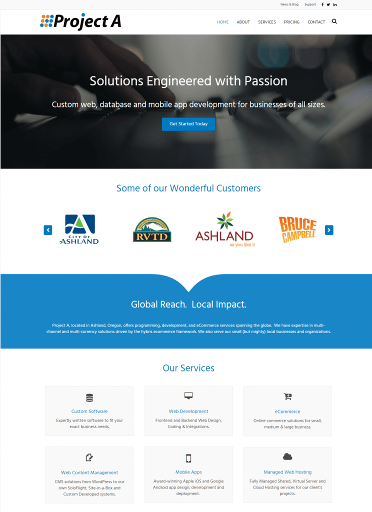
We’ve been preaching “mobile first” and responsive website design for a long time now. We just never found the time to redesign our own site. Until now. ProjectA.com has been rebuilt from the ground up using WordPress, customized data fields and custom programming. The site is now fully served over SSL, helping to keep data encrypted and secure. It also responds to fit all popular screen sizes; mobile, tablet and desktop. This is essential, as our mobile traffic is now over 50%, and if a site is not responsive, it can even hurt your search engine positioning. Despite what Google may dictate, the real reason for the redesign is to make it easier for all our visitors to quickly find out more about Project A, no matter which device they are using.
Curious enough, some of our old site’s content was created as far back as 1999! Needless to say, since our inception in 1990, we’ve accomplished a lot. But it was time to take the opportunity to reboot our website from the ground up. We welcome your feedback, and if you have any questions about the site, or your own, please don’t hesitate to contact us.